Use controls for Designing User Experience
Controls are used create a better experience for the user as well as collect appropriate data. Also, in Power Apps, we can add a variety of user interface (UI) elements to the canvas app and configure the appearance and behavior from the toolbar directly. Such that, these UI elements are referred as Controls. In the same vein, Power Apps, has most controls used in other apps, including labels, text-input boxes, drop-down lists, and navigation elements.

We can configure the appearance and behaviour of control by setting one or more of its properties. Such that, each type of control has a different set of properties. Height and Width, are common to almost every type of control, but properties, like ChevronFill are specific to only certain Controls. Additionally, other types of controls that you can add to enrich your apps include –
- Galleries – Layout containers that hold a set of controls that show data from a data source.
- Data table – Displays data from a data source in a format that includes column headers for each field that the control shows.
- Forms – Display details about your data and let you create and edit items.
- Media – Allows to add background images and sounds.
- Charts – Allows you to add charts so that users can do instant analysis.
- Icons – Include shapes, graphics, and symbols to enhance the user interface.
Important Properties of Control
- Default – Refers to the initial value of control before it is changed by the user.
- DelayOutput – Set to true to delay action during text input.
- DisplayMode – It configures whether the control allows user input (Edit), only displays data (View), or is disabled (Disabled).
- Items – Source of data that appears in a control such as a gallery, list, or chart.
- OnChange – Response of the app when the user changes the value of a control.
- OnSelect – Response of the app when the user taps or clicks a control.
- Reset – Control reverts to its default value.
- Text – Text appearing on control or that the user types into a control.
- Tooltip – Explanatory text displayed when the user hovers over a control.
- Visible – Display whether a control appears or is hidden.
Additional Controls
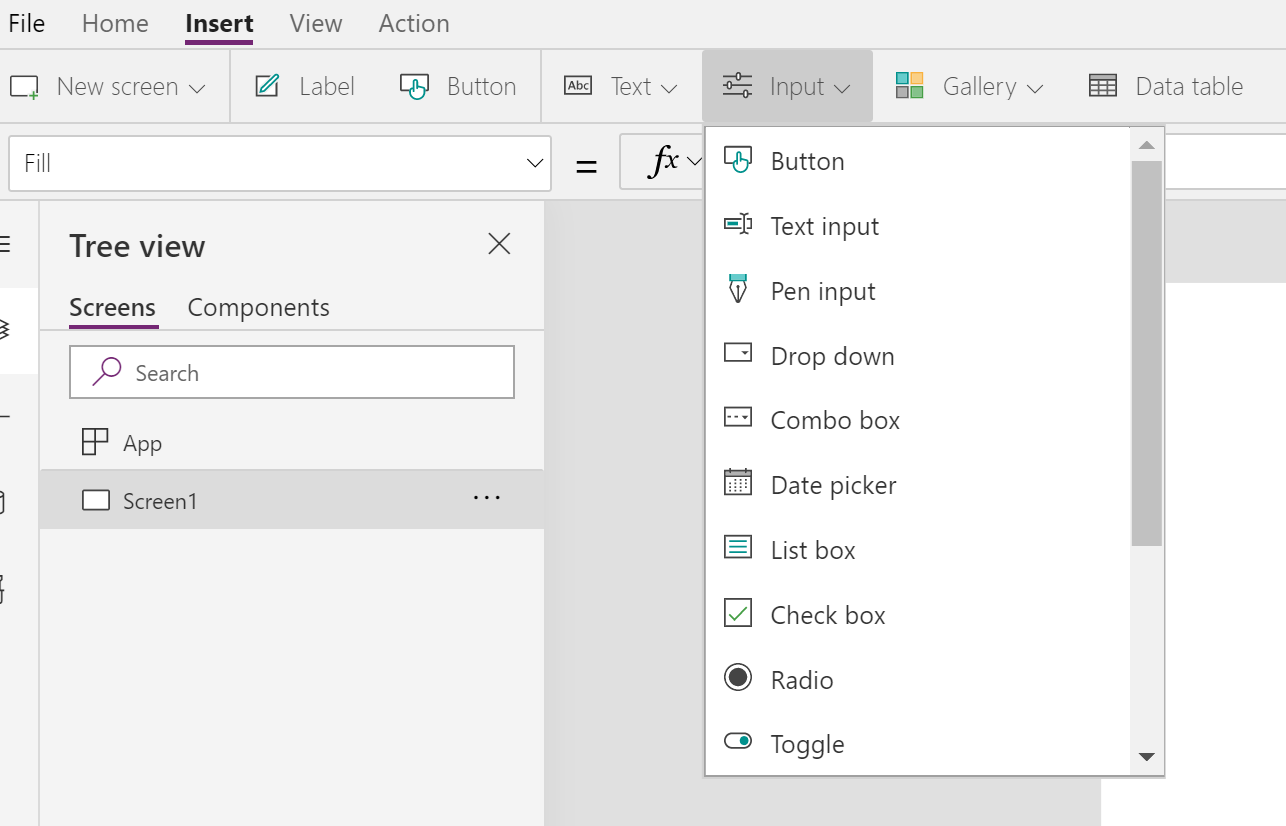
On the Insert tab, if you select the Controls heading, you will get a list of several different controls.
Controls with pre-populated values
- Drop-down – Helps conserve screen real estate
- Combo box – Allows you to search for items you will select.
- List box – Displays all available choices
- Check box – User can select or clear to set its value to true or false.
- Radio – Standard HTML input control, with few, mutually-exclusive options.
Controls for ratings
- Slider – Indicate a value, between a minimum and a maximum value specified.
- Rating – User can indicate liking by selecting a number of stars.
Other controls
- Toggle – Used to enhance the UI of the app functions the same as check box control.
- Timer – Further, it helps to determine how app responds after a certain time period
- Button – Frequently used to submit data to the data source.
Media Controls
- Video – Plays a video clip from a file or from YouTube or Azure Media Services.
- Audio – Plays a sound recording from a file, a clip from a Microphone control, or the audio track from a video file.
- Camera – Allows the user to take photos by using the camera on the device.
- Bar code scanner – Helps to use a native scanner on an Android or iOS device by detecting a barcode, QR code, or data-matrix code when in view.
- Microphone – Allows app users to record sounds from their device as long as the device has a microphone accessible.
- Add picture – Allows users to take photos or upload image files from their device and update the data source with this content.
For more details visit: Use and understand Controls in a canvas app in Power Apps