Types of Visualization in Power BI
We shall now learn about the types of visualization available in Power BI. Remember, these visualizations can be added to Power BI reports, specified in Q&A, and pinned to dashboards. Let us now discuss the various charts used for visualization in Power BI.
Area charts: Basic (Layered) and Stacked
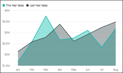
The basic area chart (referred to as a layered area chart.) depends on the line chart. Further, the area between axis and line is filled with colours to indicate volume. Moreover, the area charts focus on the magnitude of change over time, that can be used to draw attention to the total value across a trend. The basic area charts should be used under the following scenario –
- To compare the volume trend across time series
- For individual series representing a physically countable set
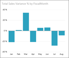
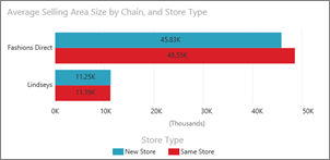
Bar and column charts
The bar charts are considered as the standard for looking at a specific value across different categories.
Combo Charts
A Combo chart is used to combine a column chart and a line chart. You will be required to select from the Line and Stacked Column and Line and Clustered Column. In Power BI, a combo chart can be referred to as a single visualization used to combine a line chart and a column chart. Thereby, combining the 2 charts into one lets you make a quicker comparison of the data. The combo charts should be used under the following scenario –

- Firstly, when you have a line chart and a column chart with the same X axis.
- Secondly, to compare multiple measures with different value ranges.
- Then, to illustrate the correlation between two measures in one visualization.
- Next, to check whether one measure meet the target which is defined by another measure
- Lastly, to conserve canvas space.
Doughnut charts
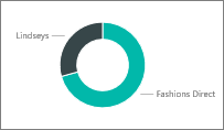
Doughnut charts are just like Pie charts. They are used to show the relationship of parts to a whole. The only difference is that the center is blank and allows space for a label or icon. Primarily, the Donut charts are used to display the proportions of categorical data, with the size of each piece depicting the proportion of each category. A doughnut chart is created using a string field and a count of features, number, or rate/ratio field.
Funnel chart
Funnels chart is used visualize a process that has stages and items flow sequentially from one stage to the next. You should use the funnel charts under the following scenario –
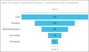
- Firstly, when the data is sequential and moves through at least 4 stages.
- Secondly, when the number of “items” in the first stage is expected to be greater than the number in the final stage.
- Thirdly, to calculate potential (revenue/sales/deals/etc.) by stages.
- Next, to calculate and track conversion and retention rates.
- Also, to reveal bottlenecks in a linear process.
- Further, to track a shopping cart workflow.
- Lastly, to track the progress and success of click-through advertising/marketing campaigns.
Key influencers chart
A key influencer chart is used to showcase the major contributors to a selected result or value. Also, the key influencers visual helps in understanding the factors that drive a metric. Also, it is used to analyze your data, ranks the factors that matter, and displays them as key influencers. The key influencers visual should be used in the following scenarios –
- Firstly, find the factors that affect the metric being analyzed.
- Secondly, contrast the relative importance of these factors.
For More visit: Types of Visualization