Visualize Data Anomalies
In this tutorial, you will learn to find anomalies within a time series data set as a batch. Also, you will learn to use Power BI desktop, using an Excel file to prepare the data for the Anomaly Detector API. Thereafter, visualize statistical anomalies throughout it.
Prerequisites to identify anomalies
- Firstly, an Azure subscription
- Secondly, Microsoft Power BI Desktop, available for free.
- Then, an excel file (.xlsx) containing time series data points. The example data for this quickstart can be found on GitHub
- Lastly, after you have your Azure subscription, create an Anomaly Detector resource in the Azure portal to get your key and endpoint.
Steps to Load and format the Time Series Data
- Firstly, open Power BI Desktop and load the time series data you downloaded from the prerequisites.
- In the second step, the excel file contains a series of Coordinated Universal Time (UTC) timestamp and value pairs.
- Thirdly, in the main Power BI Desktop window, click the Home ribbon.
- Then, in the External data group of the ribbon, open the Get Data drop-down menu and click Excel.
- Next, the dialog appears, navigate to the folder where you downloaded the example .xlsx file and select it.
- After the Navigator dialogue appears, click Sheet1, and then Edit.
- Thereafter, click the Transform ribbon in the Power Query Editor. In the Any Column group, open the Data Type: drop-down menu, and select Text.
- Lastly, when you get a notice about changing the column type, click Replace Current. Afterwards, click Close & Apply or Apply in the Home ribbon.
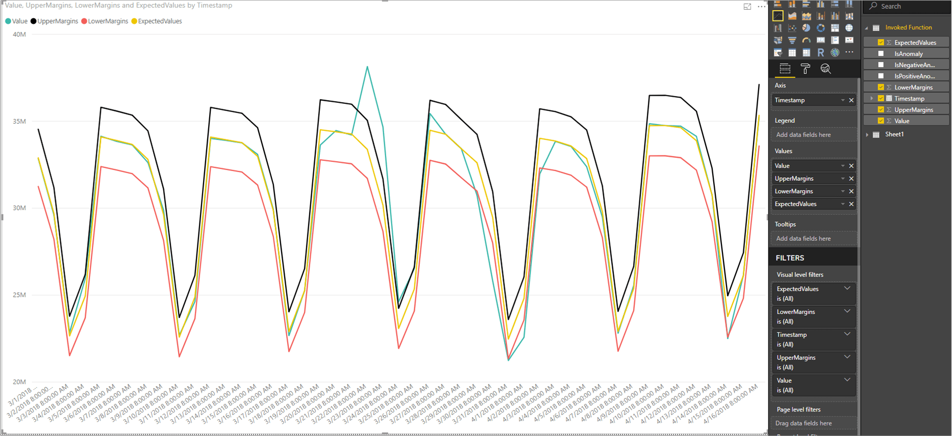
How to visualize the Anomaly Detector API response?
- At first, start using the queries created to visualize the data, in the main Power BI screen.
- Then, select the Line Chart in Visualizations.
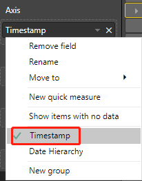
- Next, add the timestamp from the invoked function to the line chart’s Axis.
- Thereafter Right-click on it, and select Timestamp.
- Now, add the following fields from the Invoked Function to the chart’s Values field.
- After adding the fields, click on the chart and resize it to show all of the data points.
How to display anomaly data points?
- Firstly, on the right side of the Power BI window, below the FIELDS pane, right-click on Value under the Invoked Function query, and click New quick measure.
- In the second step, on the screen that appears, select Filtered value as the calculation.
- Then, set Base value to
Sum of Value. - Next, drag
IsAnomalyfrom the Invoked Function fields to Filter. - Select
Truefrom the Filter drop-down menu. - After clicking Ok, you will have a
Value for Truefield, at the bottom of the list of your fields. - Right-click it and rename it to Anomaly.
- Add it to the chart’s Values.
- Then select the Format tool, and set the X-axis type to Categorical.