Formatting and Configuring Visualization
There are various formatting options available that grant edit permissions for a report. Now, to get started, open a report in Power BI Desktop or the Power BI service providing identical formatting options. So, when you open a report in the Power BI service to perform the formatting actions use the following steps –
- First select Edit from the menu bar.
- Then for editing a report and have a visualization selected, the Visualizations pane appears.
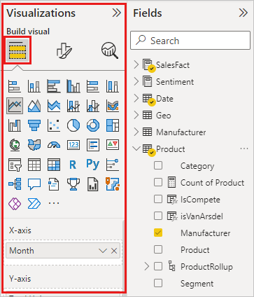
- Thirdly, directly below the Visualizations pane are three icons – the Fields icon (a stack of bars), the Format icon (a paint roller), and the Analytics icon (a magnifying glass). In the image below, the Fields icon is selected, represented by a yellow bar below the icon.
- Next, when you select Format, the area below the icon displays the customizations available for the currently selected visualization.
- Further, you can customize many elements of each visualization. The options available depend on the visual selected.
- Lastly, note that if you don’t have any visualization selected, Filters appears in place of the icons, which lets you apply filters to all visualizations on the page.
Types of Formatting Options for Visualizations
We shall now discuss about the various formatting options used to configure visualizations –
Customize colors on a visualization
- First, select a visualization to make it active.
- Then, select the paint roller icon to open the Formatting tab. The Formatting tab displays all the formatting elements available for the selected visual.
- Now, select Data Colors to expand its available customizations.
- Next, change Show all to On, and select different colours for columns.
Applying a style to a table
There are various Power BI visualizations offering the Style option. There is a full set of formatting options that can be applied to your visualization, all at once.
- Firstly, select a table or matrix to make it active.
- In the second step, open the Formatting tab and select Style.
- Then, select a style from the dropdown.
- Remember, even after you apply a Style, you can continue formatting properties, including color, for that visualization.
Changing axis properties
You can use this option for changing axis to modify the X-axis or the Y-axis. Moreover, it is somewhat like working with colors, you can modify an axis by selecting the down-arrow icon to the left of the axis you want to change. However, you can remove the axis labels, by toggling the radio button beside X-Axis or Y-Axis. Also, you can also select whether to turn axis titles on or off by selecting the radio button next to Title.