Create Measures with the Data Analysis Expressions (DAX)
In general, Power BI Desktop calculates and returns values automatically, based on the types of fields and aggregations being selected. But, there are cases when you may wish to create your own measures for performing more complex, unique calculations. Also, with Power BI Desktop, you can create your own measures with the Data Analysis Expressions (DAX) formula language.
Now, DAX formulas use many of the same functions, operators, and syntax as defined in Excel formulas. However, DAX functions are built to operate with relational data and perform more dynamic calculations as you interact with the reports. Note, there are more than 200 DAX functions that perform simple aggregations like sum and average to more complex statistical and filtering functions.
The measures that are created by you are called a model measure, which is added to the Fields list for the table you select. The primary benefits of model measures are –
- Firstly, you can name them whatever you want, thereby making them more identifiable
- Secondly, you can use them as arguments in other DAX expressions
- Lastly, you can make them perform complex calculations quickly.
Methods to create a quick measure
- First – From a table in the Fields pane, right-click or select More options (…), and then select New quick measure from the list.
- Second – Under Calculations in the Home tab of the Power BI Desktop ribbon, select New Quick Measure.
Steps to create a measure
- Firstly, in the Fields pane, right-click the Sales table, or hover over the table and select More options (…).
- In the second step, from the menu that appears, select New measure.This action saves your new measure in the Sales table, where it’s easy to find.
- Then, the formula bar appears along the top of the report canvas, where you can rename your measure and enter a DAX formula.
- However, by default, each new measure is named Measure. But if you don’t rename it, additional new measures are named Measure 2, Measure 3, and so on. since we want this measure to be more identifiable, highlight Measure in the formula bar, and then change it to Net Sales.
- Now, start by entering your formula. After the equals sign, start to type Sum. As you type, a drop-down suggestion list appears, showing all the DAX functions, beginning with the letters you type. Scroll down, if necessary, to select SUM from the list, and then press Enter.
- Expressions always appear between opening and closing parentheses. For this example, your expression contains a single argument to pass to the SUM function: the SalesAmount column. Begin typing SalesAmount until Sales(SalesAmount) is the only value left in the list.
- Then, select Sales[SalesAmount] from the list, and then enter a closing parenthesis.
- Press Enter or select Commit (checkmark icon) in the formula bar to complete and validate the formula.
- Also, if you run out of room for entering a formula or want it on separate lines, select the down arrow on the right side of the formula bar to provide more space.
- Lastly, separate parts of your formula by pressing Alt + Enter for separate lines, or pressing Tab to add tab spacing.
Steps to use your measure in the report
For adding your new Net Sales measure to the report canvas, and calculate net sales for whatever other fields you add to the report.
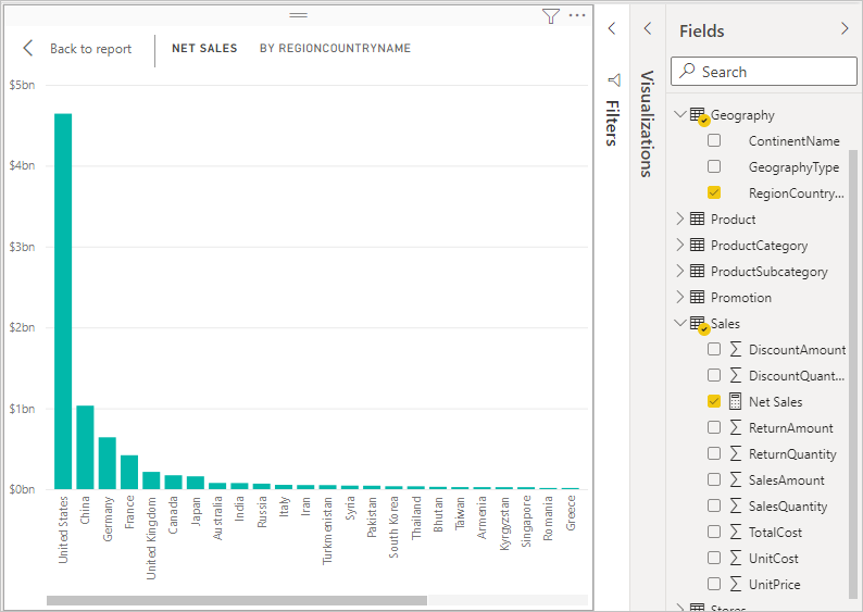
For observing net sales by country use the following steps –
- Firstly, select the Net Sales measure from the Sales table, or drag it onto the report canvas.
- Then, select the RegionCountryName field from the Geography table, or drag it onto the Net Sales chart.
- Lastly, to see the difference between net sales and total sales by country, select the SalesAmount field or drag it onto the chart.
Steps to use your measure with a slicer
Let us discuss to add a slicer to further filter net sales and sales amounts by calendar year –
- Firstly, select a blank area next to the chart. In the Visualizations pane, select the Table visualization. This action creates a blank table visualization on the report canvas.
- Secondly, drag the Year field from the Calendar table onto the new blank table visualization. Since Year is a numeric field, Power BI Desktop sums up its values.
- Then, in the Values box in the Visualizations pane, select the down arrow next to Year, and then select Don’t summarize from the list. The table now lists individual years.
- Now, select the Slicer icon in the Visualizations pane to convert the table to a slicer. If the visualization displays a slider instead of a list, select List from the down arrow in the slider.
- Lastly, select any value in the Year slicer to filter the Net Sales and Sales Amount by RegionCountryName chart accordingly. The Net Sales and SalesAmount measures recalculate and display results in the context of the selected Year field.